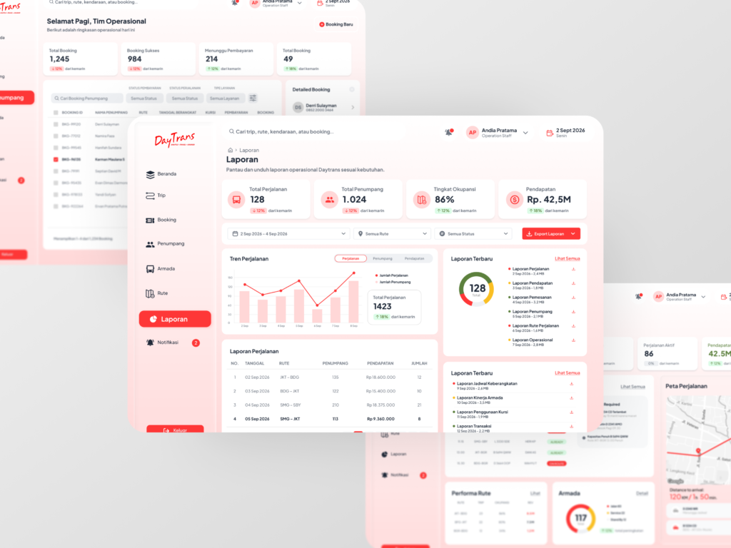
An operations dashboard concept designed to help Daytrans teams monitor bookings, track operational performance, and access critical information through a clearer, more structured interface.
I redesigned the dashboard around a clearer visual hierarchy, grouped related actions, and streamlined data presentation—helping users find relevant information and navigate key workflows with greater ease.
Case study 02
Rutin Mobile App
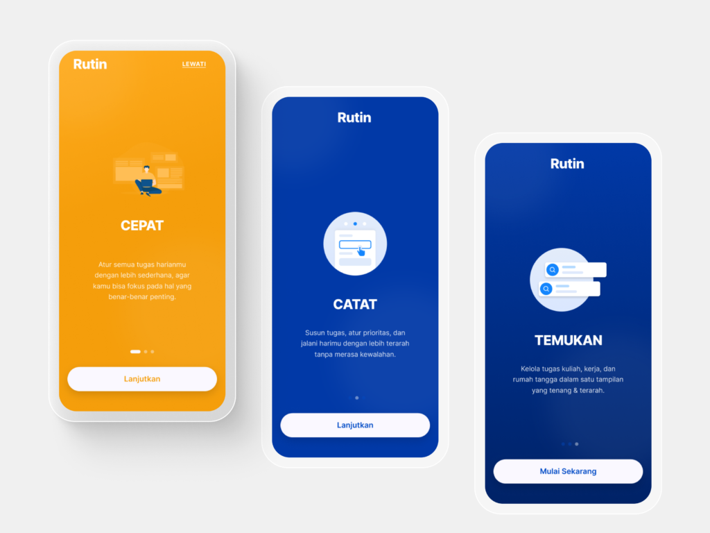
Rutin is a mobile productivity app concept that helps users organize tasks across work, study, and everyday life through a simple, focused experience.
Problem: Competing responsibilities can make daily tasks feel overwhelming.
Solution: A clear onboarding flow introduces task organization and prioritization, helping users understand the app’s value before getting started.
Case study 03
Management Business Dashboard
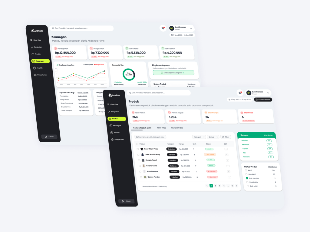
A centralized dashboard designed to make complex business operations easier to oversee. The experience brings financial performance, inventory, and product management into clear, connected views so teams can find key information and act with confidence.
The challenge was that important workflows were buried across menus, with too many steps and decisions on each screen. I redesigned the experience around a more visible path through common tasks, clearer information hierarchy, and focused screens that make progress easier to review.
Design systems
Components, type, and tokens
Selected systems work showing how modular components, typography scales, and tokens stay consistent.
Modular components
Reusable buttons, inputs, and cards built from shared parts.
Typography scales
Clear type steps that keep hierarchy readable across screens.
Design tokens
Named values for colour, spacing, and radius that scale across products.